Case Study - BrandingSelective Insurance
Be uniquely branded
Selective Insurance has been providing insurance and peace of mind to customers across the United States since 1926. Their near century-long model of engaged collaboration between employees, independent agency partners, and customers has propelled delivery of their promise–to always keep the customer at the head of the table.
Decades of proactive problem-solving, innovation, and acting on customer needs brought the company to an unexpected crossroads. The brand’s long-held tagline, “Response Is Everything,” could no longer capture the fullness of their organizational promise to those who put their trust in them. Nobody responded like Selective, but what set them apart was so much bigger.
We developed the new brand through an innovative blend of quantitative and qualitative research, drawing insights from internal stakeholders, independent agency partners, and customers.
The new brand identity brings together Selective’s distinctive employee-agent- customer paradigm and its commitment to address every customer's unique needs with customized solutions.

The new tagline captures the brand promise, communicating proactive customer-focus, bespoke care, and an elevated experience.
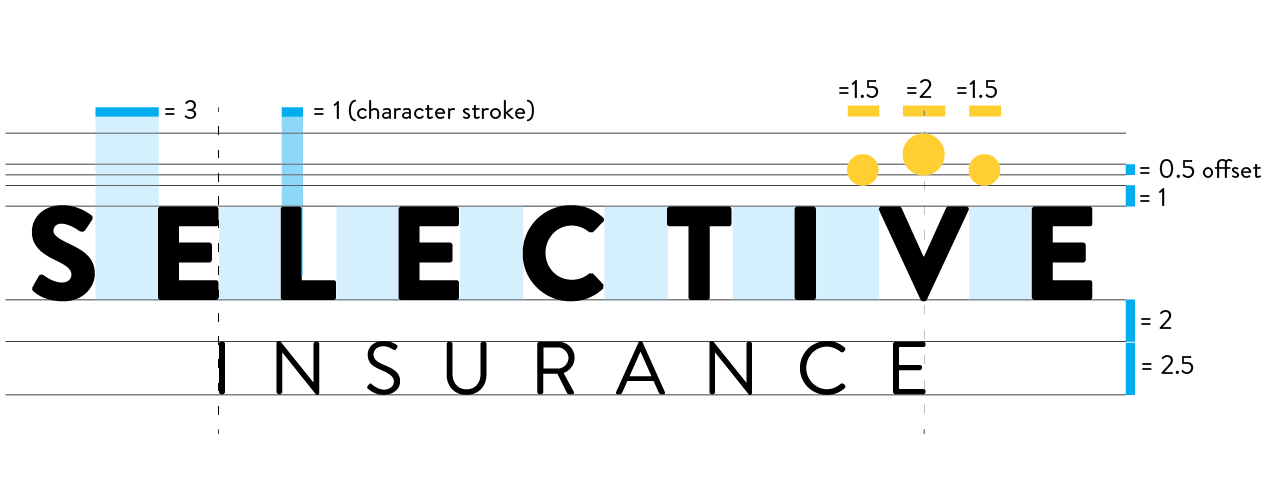
Using a rounded sans serif font, the new logo had an open and friendly appeal while also conveying modernity. The dots above the letter V represent the three players in the collaborative process that are central to success: employees (left) and agents (right) supporting the customer (larger, centered, elevated) who is “always at the head of the table.”
When using the logo with the tagline, the word “Insurance” is dropped and replaced with a tighter tracked tagline, respecting the E-to-V distance.
The new brand identity brings together Selective’s distinctive employee-agent- customer paradigm and its commitment to address every customer's unique needs with customized solutions.
The new tagline captures the brand promise, communicating proactive customer-focus, bespoke care, and an elevated experience.
Using a rounded sans serif font, the new logo had an open and friendly appeal while also conveying modernity. The dots above the letter V represent the three players in the collaborative process that are central to success: employees (left) and agents (right) supporting the customer (larger, centered, elevated) who is “always at the head of the table.”

When using the logo with the tagline, the word “Insurance” is dropped and replaced with a tighter tracked tagline, respecting the E-to-V distance.
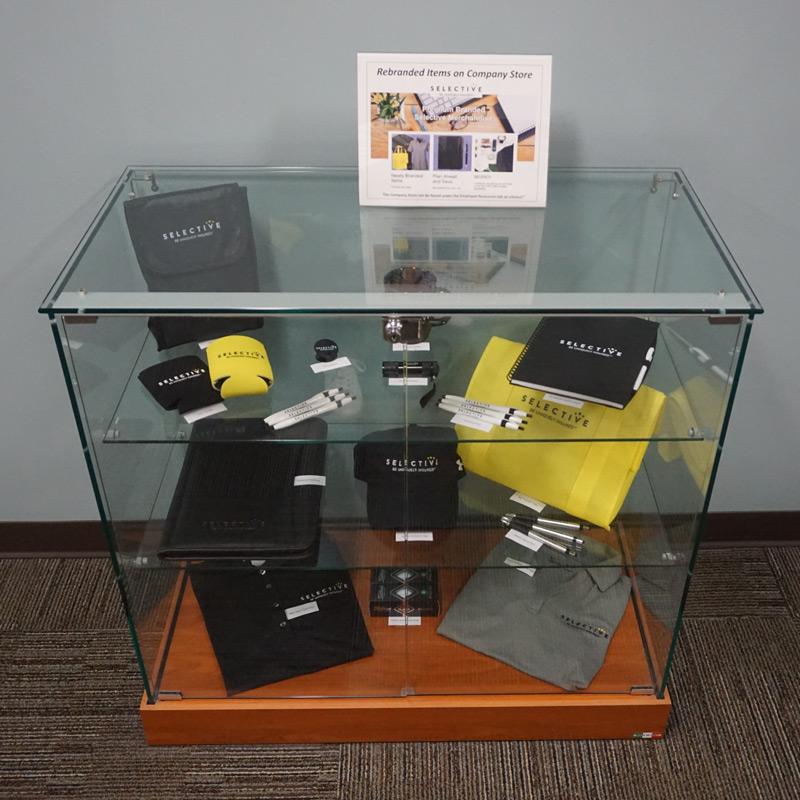
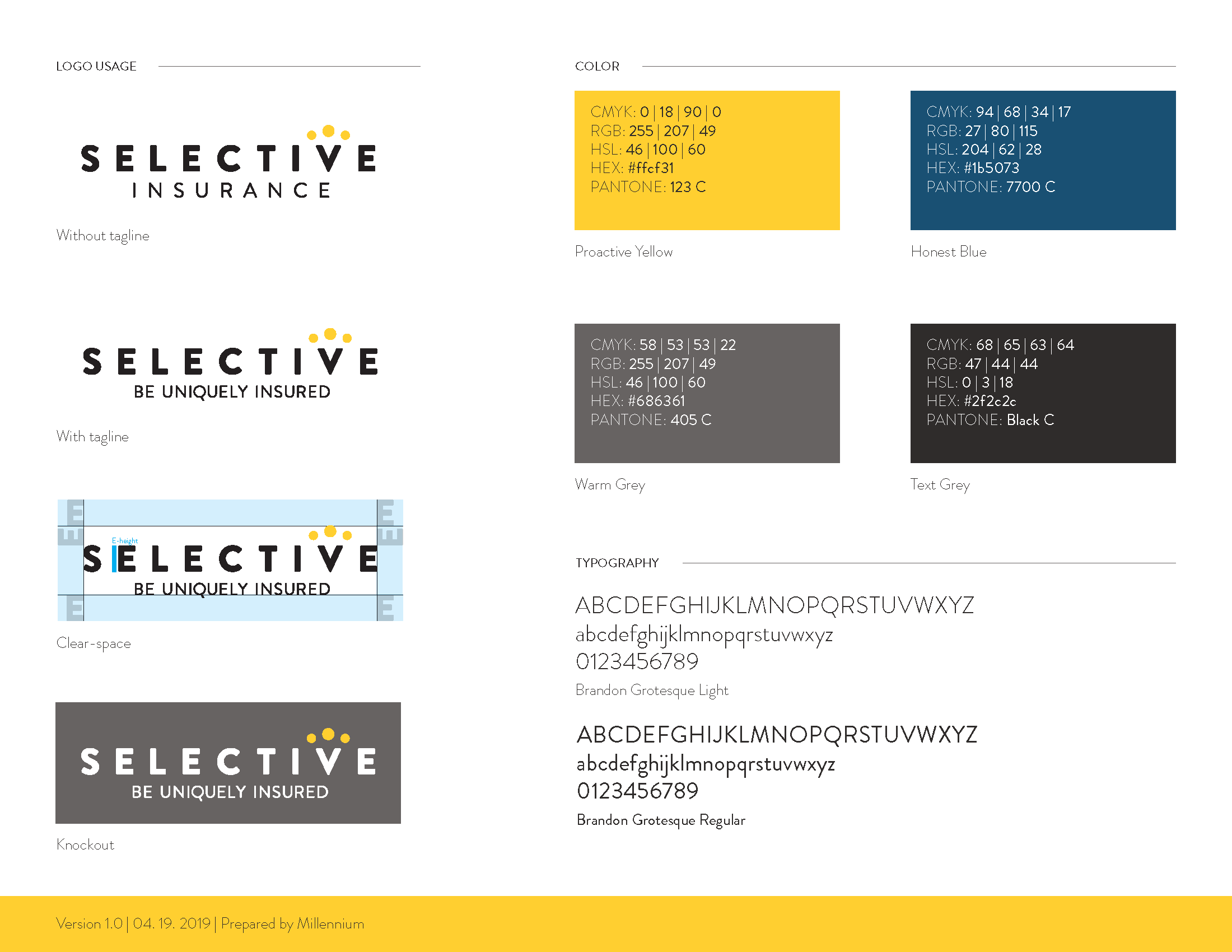
Since Selective had many ongoing projects, their internal team needed a quick guideline to ensure colors, fonts, and safe space where consistent.
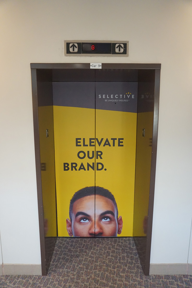
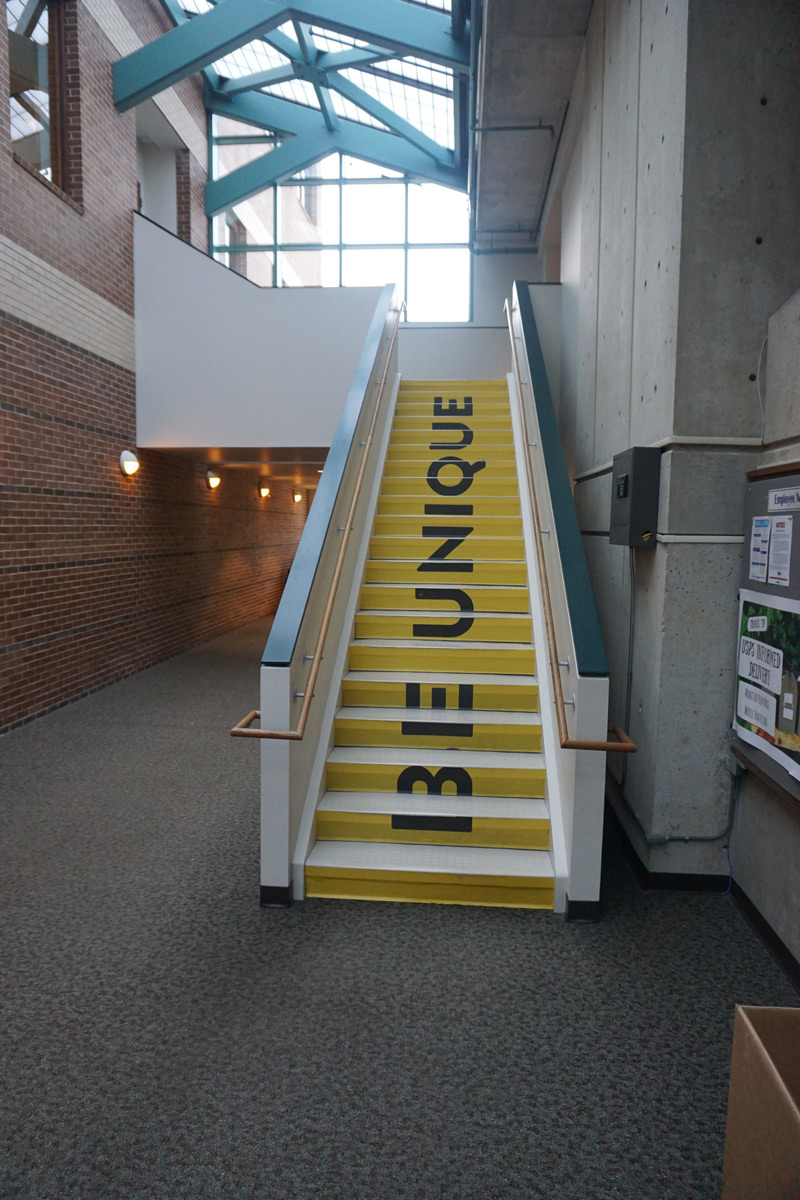
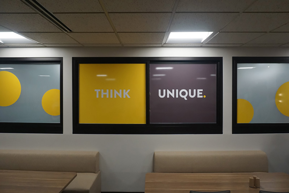
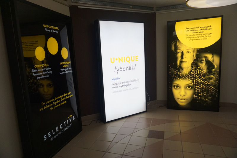
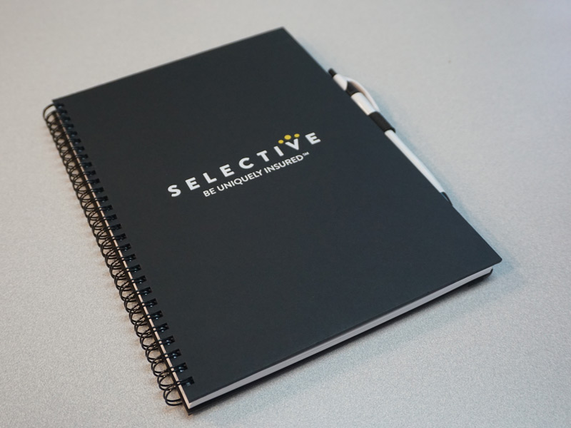
Selective’s creative team created internal signage and messaging to get everyone on board with the new brand look and feel.